
The Q2 2013 Federal Reserve's flow of funds report shows household net worth increased $1.5 trillion to $74.8 trillion in Q2 2013 and hit another record high. The thing is, magically household net worth was boosted up by unfunded pension funds. Nice huh, to have an increase in wealth that Americans do not actually have? Below is a graph of the revision to household net worth, red is the new value, blue the old.
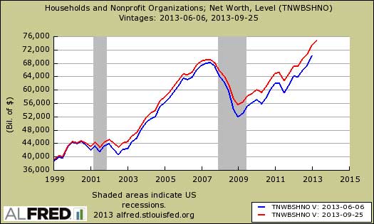
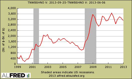
Q1 household net worth was revised upward by a whopping $3.13 trillion. Below is the difference between the previously reported household net worth and the new one. Notice the increase in disparity starting around year 2000. As we noted in revisions to national income and product accounts, the BEA in their infinite wisdom decided to count unfunded, promise to pay pension funds owed by employers as household assets.
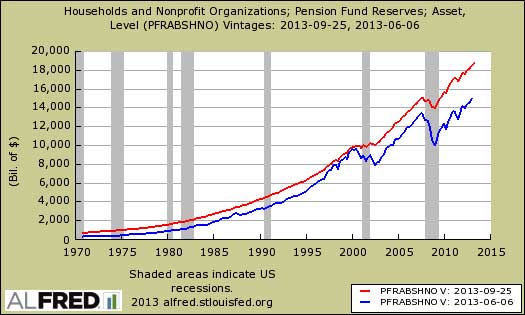
Below is a graph of now called entitlement pension funds revisions, the current in red, the past in blue. This is located in table B.100, line 30 in the flow of funds report. The current level for Q2 is $18,736.61 billion, whereas in Q1, the value is now $18,560.9 billion, an upward revision of $3.6 trillion. This is just astounding to us, for pensions have been under attack and Detroit is just one example where pensions are wiped out by declaring bankruptcy. This is a routine technique, to destroy pensions people are counting on by declaring bankruptcy and turning the pension fund over to the PBGC as happened with Delphi automotive and was a 2012 campaign issue.
The flow of funds report has always been bogus, confusing, with summary data presented as seasonally adjusted and annualized, whereas the detailed tables are in various forms, mainly not seasonally adjusted. We overview more details below, but frankly these days we're not sure what the point is, for counting non-existent pension contributions makes the report more of a fantasy land.
Household net worth shows a 7.5% annualized increase from Q1. This is a quarterly 1.8% gain and another record high. The gains were in stocks, $211 billion worth to $11.7 trillion, mutual funds by $78.6 billion and real estate values increased by $528 billion. We use the not seasonally adjusted values from table B.100 in the flow of funds report for these figures. This isn't the average or median household wealth but aggregate, the super rich net worth is intermixed with the rest of America's net wealth. Bear in mind only about 54% of Americans own any stock at all, 44% own mutual funds and the homeownership rate was 65% for Q2. Below is a graph of annual household net worth and notice the Great Recession wealth wipe out and the recovery for the rich in the below graph.

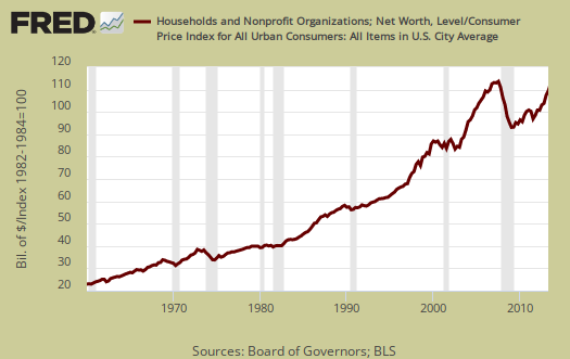
The flow of funds report does not take into account inflation, so adjusting with CPI, we get household net worth about 3.9% below the Q1 2007 high as shown in the below graph and surprise, previously this figure was 8.5% so clearly revisions now hide how much wealth was really lost from the financial crisis and housing bubble collapse.
Home equity was $9.3 trillion, yet we have an undocumented significant downward revisions in past quarters for home equity. Owner's equity as a percentage of real estate increased from 48.1% to 49.8% in Q2. Below is the graph of homeowner's equity (from table B.100, line 52).

Household debt increased at a 0.2% annualized rate and was $12.9 trillion at the end of Q2. Consumer credit increased 5.6% at an annualized rate to $2.96 trillion. Home mortgages declined by another annualized -1.7% to $9,34 trillion. Household debt has been declining since Q2 2008 as a general rule. Believe this or not, increases in household debt are taken as a positive economic sign we we little people are then spending more, except for those of us who have to make the payments. In debt we trust. Bear in mind in the flow of funds table B.100, where this data resides, is not seasonally adjusted, yet the Fed, in their magic wisdom publishes the annualized quarterly change rates using seasonally adjusted data.
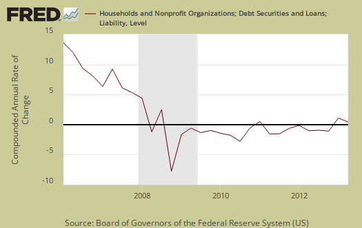
Below are home mortgages. Less mortgage debt doesn't necessarily mean people paid off their loans and this figure also includes people who lost their homes in foreclosure or sold them, short.

Below is overall Household debt to GDP, as ratios typically used by the IMF to see if a country is in debt trouble. While we see a healthy decline, it's still an astounding overall percentage of 77.8%.
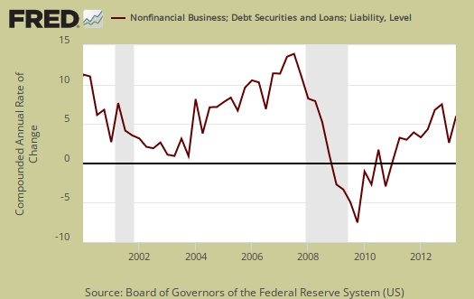
Nonfinancial business debt increased 6.9% on corporate bonds outstanding...again. This is because the interest difference is free money due to de facto zero federal funds effective rate. Additionally, the below graph shows the annualized percent change of business debt against the gray bars, which mark recessions. Businesses do not take on more debt in recessions, although the free money from bonds maybe distorting the correlation.
Federal Debt rose 2.5%, annualized for Q2. 2012 saw a 10.9% increase in the federal debt. State and local debt increased 1.1%, annualized, for Q2. Below is a scary graph showing Federal debt as a percentage of GDP over time.

Total domestic debt, which is household, government and business increased 3.1% from Q1 to $41,041.4 billion. This debt is 9.8 times larger than U.S. GDP ($16,667.9 billion annualized, quarterly debt also annualized to create ratio, total domestic debt is listed in Table D.3). From the report:
Domestic nonfinancial debt outstanding was $41 trillion at the end of the second quarter, of which household debt was close to $13 trillion, nonfinancial business debt was $13.1 trillion, and total government debt was almost $15 trillion.

Corporate cash is now $1801.2 billion, which is pretty much no change from Q1's of $1802.4 billion, but at record highs, especially with Q1's revisions. Corporations are still sitting on a boatload of cash, at record highs, as shown in the below chart which adds up the flow of funds elements which comprise corporate cash.

The flow of funds is impossible to read and over 100 pages. The flow of funds is a very messy report, with some figures annualized, others rounded previously and some percentages concatenated to the nearly quarterly percentage point. Additionally some figures are seasonally adjusted while others are not. The tables to zero in on are the balance sheets, B.100 - Households and Nonprofit Organizations and B.102 - Nonfinancial Corporate Business.
You might also be interested to know exactly what is meant by the claim corporations are holding onto buttloads of cash that the press reports but does not explain.
The report from which corporate cash comes from is incorporated businesses which are not financial or farms. That excludes insurance companies too. Then, liquid assets are also referred to as cash. Why? Because this stuff is easily turned into currency or directly represents currency, such as time deposits. What does the Fed classify nonfarm, nonfinancial businesses' assets as liquid? The list is: municipal securities and loans, commercial paper, checkable deposits and currency, total time and savings deposits, money market mutual fund shares, total U.S. government securities, private foreign deposits, federal funds security repurchase agreements, and mutual fund shares.
In the flow of funds report, you can find total liquid assets on line 42, L.102 Nonfarm Nonfinancial Corporate Business table.
The flow of funds is different from the Census report on households.
Here are other flow of funds, overviews, only some graphs revised.
i'm below average, how bout you?
based on the Census count of households, US wealth averages $651,970 per household; so everyone with less is below average...
rjs