
ADP, released their proprietary private payrolls jobs report for November 2012. This month ADP is reporting a gain of 118,000 private sector jobs. As expected, superstorm Sandy cost 86,000 estimated job losses. Graphed below are the reported private sector jobs from ADP. This report does not include government, or public jobs.

Below are the month job gains or losses for the five areas ADP covers, manufacturing (maroon), construction (blue), professional & business (red), trade, transportation & utilities (green) and financial services (orange).
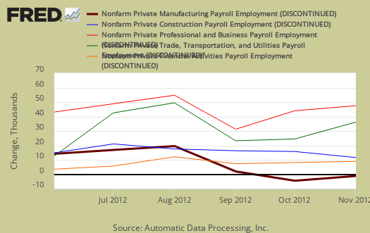
This month manufacturing once again got hammered with a loss of 16,000 jobs. Construction gained 23,000 jobs, Trade/transportation/utilities also gained 22,000 jobs, Financial activities jobs increased by 13,000 and Professional/business services increased by 16,000.
Sandy's effects hit manufacturing, retailing, leisure and hospitality, and temporary help industries. Yet notice manufacturing job losses by ADP's accounting before the storm, going back six months.
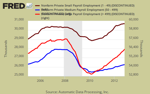
We also have ADP's older three level breakdown in jobs by business size. Small business, 1 to 49 employees, added 19,000 jobs, medium, 50-499 employees, added 33,000 and large business added 66,000 to their payrolls.
Below is the graph of ADP private sector job creation breakdown of large businesses (bright red), median business (blue) and small business (maroon), by the above three levels. For large business jobs, the scale is on the right of the graph. Medium and Small businesses' scale is on the left.
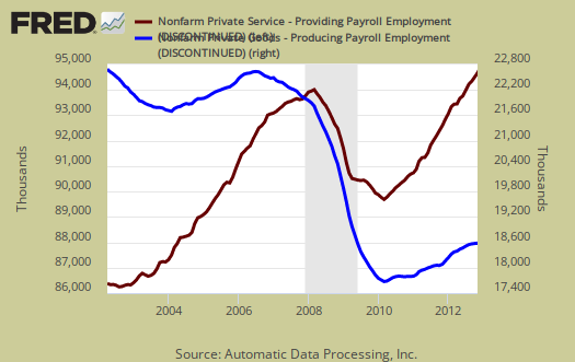
One of the more interesting aspects of the ADP report is the breakdown of the private sector by service producing and goods producing jobs. Service producing sectors are beyond the ones tracked and created 114,000 payroll jobs for November. Goods only gained 4,000 private sector jobs. Service sector jobs include restaurant workers, housekeepers, teachers, health care workers and are disproportionately lower paying jobs as a whole. What we see are jobs which produce tangible goods being lost. Construction jobs are considered goods producing jobs. Below is the graph of ADP service sector (maroon, scale left) jobs against their goods production jobs (blue, scale right).
This report, if it matches Friday's official unemployment report, would overall imply overall not enough job growth to keep up with population. Governments have been shedding jobs, which are part of the BLS report and we expect manufacturing to be hit particularly hard due to the industrial production figures. The U.S. needs about 100,000 jobs per month, minimum just to keep up with population growth, with the same lousy labor participation rate.
The monthly BLS jobs survey (CES) has a 100,000 payroll jobs overall margin of error. ADP changed their methodology and now claim to match the BLS private payrolls, but only historically, after revisions. Time will tell.
The below graph shows shows how many private sector payroll jobs, each month, ADP was off by in comparison to what the BLS reported. This is a monthly graph, not cumulative. As we can see, it's been rare where the two monthly reports get the exact same private payrolls growth numbers. When the below graph bar is negative, that means the BLS reported a larger number of private jobs than ADP did, when the graph bar is positive, it means ADP reported larger private payrolls. Again, compared are private sector jobs which is different from the BLS headline number. This graph will be updated with the November BLS jobs report.
Below is the cumulative difference between what the ADP reports as the private nonfarm payroll jobs vs. the BLS (ADP minus BLS). This line shows the divergence, over time in number of nonfarm private payroll jobs reported between the two reports. Previously the difference between ADP and BLS was around 400,000, now we see the cumulative error more in line with the real BLS CES survey margin of error. Here again we see a massive change in the ADP private payrolls methodology. This article will be updated with the November BLS private non-farm payrolls data. Below is the difference between the revised series.
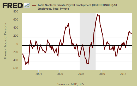
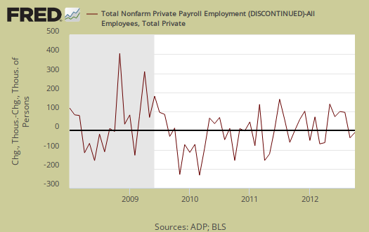
The graph below is the monthly change of private jobs as reported by ADP. Time will tell if we can just blame Sandy, but notice how in alignment this month's change is to the past year or so. We simply are not creating enough jobs, by any measure, superstorm or not.

Regardless of the statistical differences between ADP and the BLS, November's report indicates Sandy packed an economic wallop the last thing the United States needs. Moody's mentions the Fiscal cliff not impacting payrolls. We say yet, businesses are becoming increasingly frustrated with Congress and their putting the economy at risk over their political power plays.
Here is our overview of last month's ADP private sector jobs report overview, only graphs revised. October was revised downward by 1,000 jobs. This article goes into the methodology details on the ADP report changes and compares historical data of the two methodologies in graphs.
Recent comments