
The rich get richer and income inequality in America continues to grow in 2013. The wage situation improved from 2012, but it's still pretty bad. The median wage was $28,031.02 in 2013 a paltry 1.9% increase from 2012. While the ratio of median wage to average wage improved, the 110 super rich are now earning 2595 times more than average workers.
The social security administration keeps statistics on average and median wages as reported on Federal income taxes and contributions to deferred compensation plans. They use income tax data to calculate your social security benefits. Below is a chart of the average wage and median wage from 1990 to 2013.
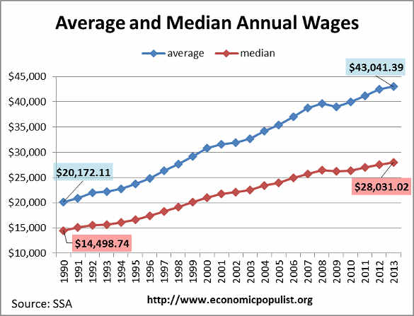
The average wage has increased 113.4% since 1990, yet the median wage has only increased 93.3%. The reason the average wage has increased more than the median is the super rich bias the average higher. Average wages are calculated by taking the total compensation in America and dividing by the number of wage earners, whereas median means 50% of all wage earners earned that amount or less.
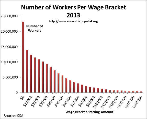
Most of America is still working for very little, illustrated by the below graph of wage earners by income bracket. A shocking percentage of wage earners, 14.8%, make less than $5,000 per year. Almost a quarter, 23.8%, of all wage earners make less than $10,000 per year and almost a third, 31.7%, of American wage earners make under $15,000.
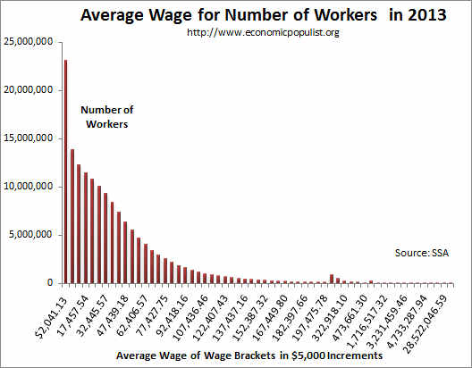
The average wage within these income brackets is also telling of the real American wage slave. For those making less than $5,000 a year, the average wage is $2,041.13. For those making between $5 thousand and $10,000 the average wage is $7,407.88. That's 13.9 million people earning between $5,000 and less than $10,000 a year, right here in America. An astronomical 23.1 million wage earners made less than $5,000 per year in 2013. Overall, there were 155.8 million earning wages in 2013.
We have to wonder why the news is full of the few billionaires and their lives. Most of America has nothing to do with those very few at the top of the money heap. Those earning less than a million dollars a year is 99.9% of all wage earners. Most Americans, 52.4%, make less than $30,000 a year yet those very Americans have only have 15.3% of the total income from wages.
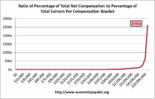
Below is a distribution graph, per compensation bracket, of the percentage of wage earners in that bracket (blue), vs. what the percentage of total compensation is for just that wage bracket (red). The chart shows, per wage bracket, how many people are in that wage range and what percentage of the total compensation pie they receive. We see a few people in the $250 thousand or more income categories getting way more than their fair share of the total net compensation income pie. If there was more income equality in the United States we would see the blue bars matching the red ones. Notice how the blue bars, representing workers, disappear long before the red bar, representing income does. This means the very few at the top are getting way too big of a lion's share.
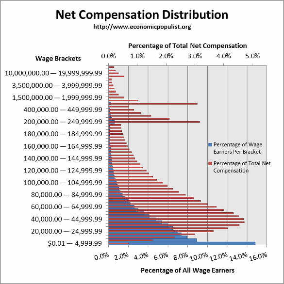
To put this in perspective, the top wage bracket is over $50 million and over and 110 people are in it. This miniscule percentage of total wage earners, 0.000064%, received 0,18% of the total net compensation earned in 2013. That means as a group, these $50+ millionaires have 2595 times more money distributed to them as a population size than those earning the average wage of $43,041.39. Those making less than $5000 a year are only getting 0.7% of the total compensation pie, as a group This is income inequality in stark colors and once again the rich get richer still.
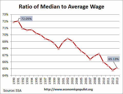
The super rich have historically been grabbing much more of the income pie and as a result they are biasing the average wage upward. For 2013 the average wage grew by 1.3%, whereas the median wage had a bounce back and increased by 1.9%. Below is a graph showing the ratio of the median wage to the average wage. In a space of two decades we see a significant downward slide in this ratio which shows income inequality increasing. In 1991 the median wage was 72.05% of the average wage. By 2013 that percentage had slide to 65.13%.
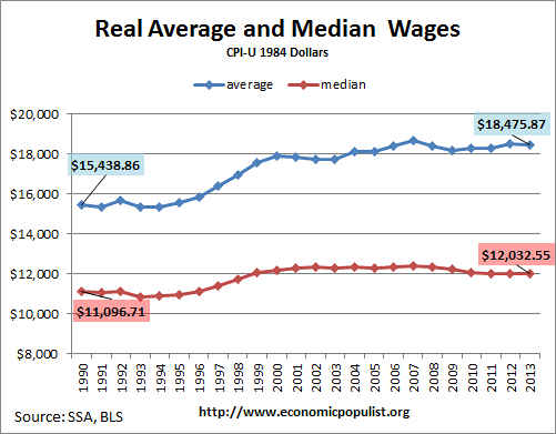
When one takes inflation into account we have another bleak story. Overall wages are barely keeping up with rising prices. The below graph shows the average and median wage adjusted for inflation. Since 1990 real average wages have increased 19.7% and the median wage has increased 8.4%. Yet this is recent with both the median and average real wage below their 2007 values. While wages are finally keeping up with overall inflation, it's barely and real wages have also not recovered from the great recession.
The bottom line here is the rich are getting richer and most of America continues to get squeezed even though in 2013 wages improved. As a trend we can see since 1990 just a never ending attack on regular wage earners in this country. The bounce back in 2013 isn't enough to make up for 30 years of a spiral down.
The Social Security Administration defines net compensation here and it does include anything subject to taxes as reported on a W-2 by employers. We like to use these statistics for they come directly from tax records and thus are probably much more accurate than other estimates.
This article is an update on 2012 wage statistics and this one, 2011 wages in America. For more details of past 2010 wage data see our popular post, wages in America, most of us are have nots and article Wage statistics pain a bleak picture.
Comments
wage/income disparity
Despite the spin from the likes of the Hoover or Cato Institutes these numbers/stats do not put our economy/future in a very good light. The irony of all this , if you are a retail (small) investor; is that you need medium income wage earners to buy the "stuff" varied companies produce. Less income , less purchases. I hold no hope in Conservative or far right think tanks to "get" this. Hopefully, this obvious economic path will ease; it cannot continue as this article points out; it's simply not substanable.
New Fed Stats on Family Finances
62 million households in America’s least affluent half averaged only $11,000 in net worth last year, 50 percent less than bottom-half families averaged after inflation in 1989. Over those same years, top 5 percent household average net worth nearly doubled — to $6.8 million.
America’s “pace of new business creation,” the Fed chair details, “has gradually declined” as inequality in the United States has increased. This “slowdown in business formation” may be jeopardizing “a significant source of economic opportunity” for families “below the very top in income and wealth.”
http://www.federalreserve.gov/pubs/bulletin/2014/pdf/scf14.pdf
Heads of Household
How does this analysis change if you count only heads of households? For example, at least some of the low wage earners are kids and students who aren't supporting themselves.
no head of househol data
This is from the IRS just wages reported from W-2 in aggregate.
Not so bad
The last chart is the one to look at. It shows that yes, the real wage has been squeezed since 2008 by about $200 or so per year, and has not made a comeback. Also it shows that the median wage has been nearly flat since 2000, gaining a measly $500/year despite the mega-rich taking off in terms of earnings. But I was heartened that the situation isn't nearly as bad as the narrative suggests, especially considering that deflation rules in many areas that are growing in the economy (the tech sector).
Here is a suggestion: "give back" the regressive payroll tax (for everyone... insuring that it goes into their pay), and "make it up" with a real, solid, un-avoidable-using-trusts-and-donations and such tricks global DEATH TAX! No one needs more than $5 million in assets to live a nice life in this country, so limit all inheritance to $5 million per head. Then the progeny of the rich become as motivated as the self-made zillionaires. Use the multiple tools of coersion that is the US gov't to ensure that no richies export their money and sneek away. Help other gov'ts that want their dead richies to pay up, make 'em pay. Try to get every country in the world to use this approach to gov't funding.
You hard core re-distributionists out there should take heart... this does redistribute just about everything, if you are looking at a long enough time frame (70 years)... and socially stability wise, this is the time frame that really matters. You hard core property rights types should also be happy... no living person gets taxed! You subtle thinkers (conservatives?) who think that family rights should be carved out for family farms, etc.. To you I say tough luck. Family based inheritance has caused a great deal of misery over the millenia of history and needs to be removed from the world root and branch. Families don't earn money... individuals do. Therefore individuals should be allowed to keep (and spend) most of what they earn, (in their lifetimes) but should not be allowed to fund the next generation or set up perpetual tax-dodges. This is real populism. It lets everyone do their thing, lets the little guy keep his money (by paying little or no taxes), and lets the little guy become a zillionare if they can. Viva la American dream!
Time to pick a career that provides for the family
Sure, these are sobering statistics, but America is still a land of opportunity. You can just no longer get a degree in soft sciences and expect to live as a middle class American. I came from a lower middle class family, studied hard in college for a worthwhile degree, and got a good job because of my grades and major. Now, I'm doing fine. The vast majority at the same college I attended were getting worthless degrees while financing their life by credit cards, and partying. This article makes it appear as if you are to just lay down, stay inside your tenement, and just give up. Oh, and all of my career was built during the recession (gasp!). Over 80% of the millionaires in the U.S. are first generation.
blame the victim mentality
There for the Grace of God Go I. So you may have worked hard, been bright enough and gotten a great job but what you do not realize is that's *so far*. There is age discrimination, all sorts of problems as to why people go broke and it has nothing to do with their own actions.
I need stats
I need the sources for your second and third graphs, "Number of Workers Per Wage Bracket" and "Average Wage for Number of Workers", both given as SSA. Also I need them for as far back as possible, not just 2013. This is to calculate my statistic, the Weariness Index, which approximates the mean number of hours of work needed to earn a basket of goods. I tried to register in Economic Populist but it stalled after I answered the account details email.
wage stats source
The source of all of this is the SSA, the same link at the top of the post. I believe you can go back years on their site but the result is in HTML, so you must convert.
Also, I calculate much of this from the original data published by SSA, but the two you are looking for are on their site, top link. Let us see your weariness index! I think America is pretty weary!
Weariness Index
The Weariness Index is easy to define. If CPI is an honest (?) price index (i.e. dollars per basket), and MOI is the mean of the inverse hourly wages or of the inverse yearly salary of a full-time worker (i.e. hours per dollar), then WearinessIndex = index(CPI*MOI) = index(CPI/(harmonic mean of wages)). Thus it is an index of mean hours worked to earn the basket.
I estimated this years ago based on very crude data from 1971 to 1986, and it had increased (gotten worse) 13% over that period. The Weariness Index is a universal sum, in the sense that it indexes an approximation to the total of something (the hours worked by everyone to earn their baskets). Thus it is like mean income (everybody's earnings) and CPI (everybody's cost of the basket), but not median income, which is insensitive to something happening to less than 50% of the workers. My index was sensitive to the felt economic disaster of the end of the 1970s.
Larry Dickson