
The January Consumer Price Index had no change from December. CPI measures inflation, or price increases. The culprit is gas prices again, which declined -3.0% for the month. Take food and energy items out of the index and CPI actually rose 0.3% from December.

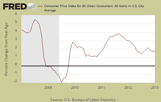
CPI is up 1.6% from a year ago as shown in the below graph. We can see this inflation measure is fairly low.
Core inflation, or CPI minus food and energy items, increased 0.3% for January. Core inflation has risen 1.9% for the last year. Core CPI is one of the Federal Reserve inflation watch numbers. These low figures probably help justify continued quantitative easing, which usually increases commodity prices. A global economic slowdown will trump quantitative easing effect on commodities due to overall weaker demand.

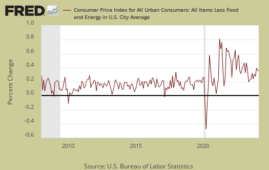
Core CPI's monthly percentage change is graphed below. This is the largest monthly core infltaion increase since May 2011.
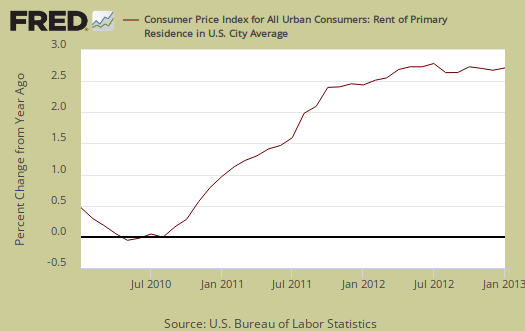
Core inflation's increase seems to be across the board. Shelter increased 0.2% and is up 2.2% for the year. The shelter index is comprised of rent, the equivalent cost of owning a home, hotels and motels. Rent increased 0.2% and lodging away from home, or motels, hotels jumped 1.2% for the month. Airfares increased 1.1% from December and this is the 5th month in a row where air travel prices have increased. Used cars and trucks had it's first increase in seven months, 0.2% while apparel increased 0.8%. Graphed below is rent, where cost increases hits people who can least afford it most.
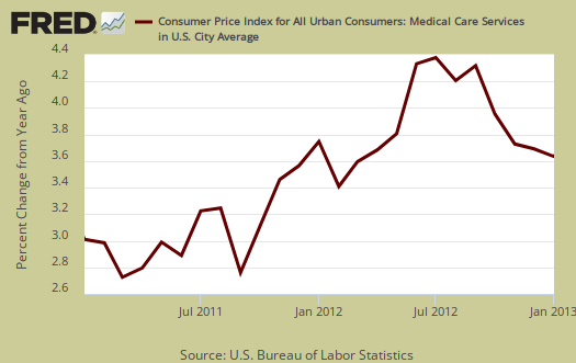
A core inflation cost which never drops is medical care. Medical care services increased 0.2% and has increased 3.6% over the last 12 months. Nowhere else do we see a ridiculous, constant increase in costs every single month. You'll never see the below graph go below zero, unlike other item prices.
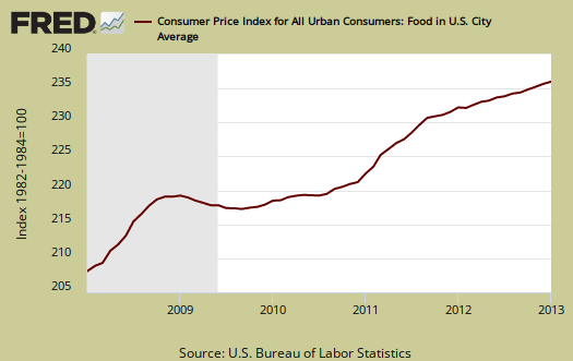
Food and beverages overall had no change from December and have increased 1.6% from a year ago. The food at home index (think groceries) had no change for the month and is up 1.1% for the year. Eating out, or food away from home increased 0.1% from last month and is up 2.3% from a year ago.
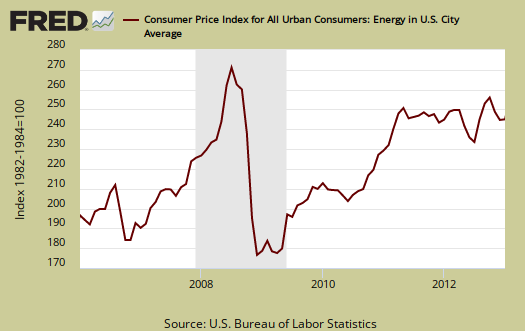
Energy overall decreased -1.7% for January, and energy costs are now down -1.0% for the last 12 months. The BLS separates out all energy costs and puts them together into one index. Energy costs are also mixed in with other indexes, such as heating oil for the housing index and gas for the transportation index. Below is the overall CPI energy index, or all things energy.
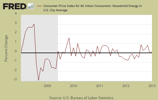
Graphed below is the household energy index which includes electricity and natural gas, shown by monthly percentage change. This month the index increased 0.5% and the reason is electricity, which jumped 1.1% in January. From this time last year household energy has decreased -0.4%. This is a different, special index to show the overall costs for energy into your home only, (unless you drive your car in your mansion or run generators for your tent) and represents about 4.1% of month assumed expenditures.
Graphed below is the CPI gasoline index, which declined -3.0% this month and the 4th month in a row. Don't expect this to last as gas prices are zooming back up in February.
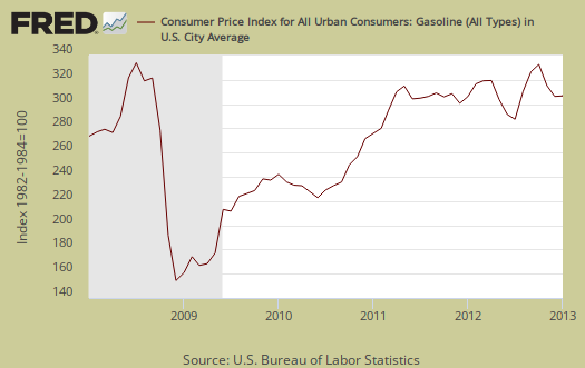
Below are gas prices, last updated February 19th, where gas was $3.75/gal. High oil prices have a strong correlation with recessions ad we can see next month's CPI should increase over the jump in gasoline.

According to the BLS, for the year, food and beverages, which includes food at home, made up 15.3% of the index. Housing is 41% and transportation, including gas for the car, is 16.9% and all energy is 9.5%. Medical care is only 7.2%, they claim, which goes to show what averges can remove. Most people are not sick and why the average costs are so low. A Medical event can bankrupt a family, with insurance.
CPI-W is used to calculate government transfer payments, such as social security increases. The cost of living adjustment (COLA) for social security and other government payments will be 1.7% for 2013. For January CPI-W increased 0.3%, not seasonally adjusted for the year has increased 1.5%.
Chained CPI
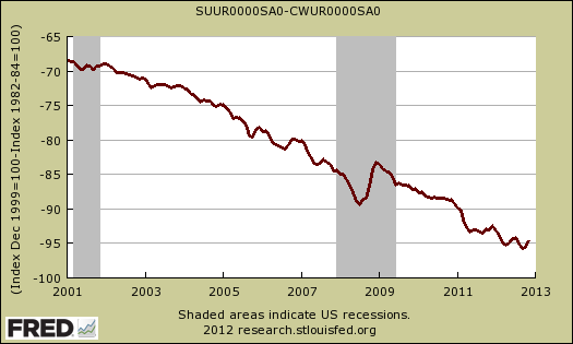
There is a lot of effort to reduce the social security cost of living adjustments by using chained CPI instead of CPI-W as an inflation index. In a nutshell, chained CPI will lower those cost of living adjustments than using the CPI-W. Below is the not seasonally adjusted monthly difference between chained CPI and CPI-W, up to November, as the indexes would be used in the cost of living adjustments. As we can see over time, chained CPI's cumulative effects will be to reduce social security benefits.
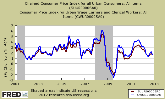
Below is the percent change from one year ago between chained CPI in maroon, against CPI-W in blue. Against we see the percentage increases from one year ago would be less, which means a lower cost of living adjustment for social security.
Using chained CPI instead of CPI-W is a glorified way to cut social security benefits. Chained CPI allows for more substitution and with medical costs, there is no substitution for say heart bypass surgery. Substitution is an ongoing controversy in CPI. The claim is when prices on one item skyrocket, the consumer can substitute that item for another. In other words, if steak prices skyrocket, the consumer can start eating chicken or hamburger. This is why the attack on social security is often referred to as cat food, for cat food would be eventually substituted for groceries using chained CPI.
CPI details
The DOL/BLS does take yearly surveys on where the money goes in the monthly budget, but as one can see, food and energy are significant amounts of the monthly finances. Run away costs in these two areas can break the bank, so can food. Additionally CPI uses substitution, so if steak goes through the roof, somehow we're all just fine with hamburger and prices didn't really overall increase much.
Other CPI report overviews, unrevised, although most graphs are updated, are here. If you're wondering why the graphs look weird, the graph calculates percentages from the index and doesn't round. The actual data from the BLS report does round to one decimal place. In other words, 0.05% is rounded to 0.1%.
Recent comments