
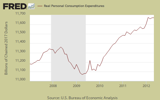
Consumer spending was unchanged from last month, but after taking price increases into account, shows a 0.1% increase. Personal consumption expenditures are often called consumer spending by the press. Real Personal Consumption Expenditures, or PCE, are about 71% of GDP. Real means chained to 2005 dollars, thus adjusted for inflation. Below is a graph of real PCE. This is not good news for Q2 GDP.
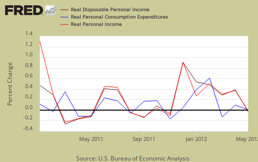
The Personal Income and Outlays report covers individual income, consumption and savings. While disposable income increased by 0.2%, when adjusted for inflation, disposable income was actually a 0.3% increase. Personal income increased 0.2%, but adjusted for inflation and payments from the government removed, increased 0.4%. Wages were flat. The personal income & outlays report is annualized and seasonally adjusted. Below are the monthly changes for real personal income (bright red), real disposable income (maroon) and real consumer spending (blue).
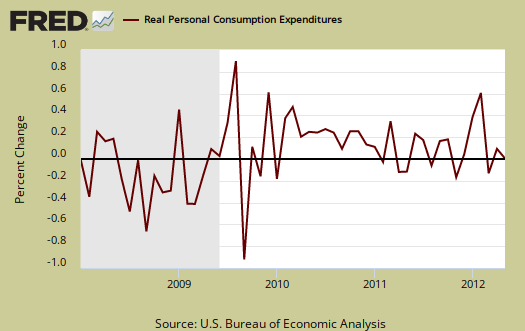
Using the first two months of the three which make up Q2 GDP, or April, May and June, and assuming another 0.1% real PCE growth for June, it's looking like 1.5% growth for real consumer spending for Q2. C or real PCE growth was 2.5% in Q1 2012 GDP.
If there is no PCE growth for June, PCE would change by 1.13% for Q2 2012 GDP. In other words, PCE looks like it will be very weak for Q2's economic growth unless June has some sort of magical blow out and there are no other indications that would be so.
To estimates, we use the compounded annual rate of change, or , where for each quarter, the data was a simple average of the monthly annualized PCE chained values, or
. Below are the raw PCE totals, in adjusted for inflation dollars.
Consumer spending is not just automobiles, smartphones, toys and Starbucks. Things like housing, health care, food and gas are the majority of consumer spending. In other words, PCE is about paying for basic living necessities. Graphed below is the overall real PCE monthly percentage change.
What people spent money on, adjusted for prices, or in real dollars, by monthly percentage change was:
- durable goods: -0.4%
- non-durable goods: +0.3%
- services: +0.2%
Health care, for example, is a service. Gasoline is a nondurable good. Cars are a durable good. Additionally when people are cutting back, durable goods are usually the first things to go, especially large ticket items.
Price indexes are used as divisors to adjust for inflation and price changes. The indexes are used to compute spending and income for an apples to apples, real dollar comparison to previous months and years. Economic statisticians use real dollars so one does not erroneously assume economic growth when it's really inflation.
The PCE price index is used to remove inflation from consumer spending and income, reported above. PCE decreased, -0.2%, for May and is up +1.5% from a year ago. Minus energy and food, the price index increased +0.1% and is up +1.8% from this time last year. The energy index for personal consumption has dropped, -3.8% from one year ago and the food index is up 2.3% from May 2011. While the PCE price index represents inflation, it is different from CPI.
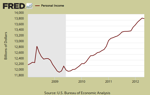
Personal income increased +0.2% in May and these numbers are the total for everybody in the United States who is reported and not part of the underground economy. Below is personal income, not adjusted for inflation, or price changes.
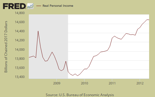
Real personal income, or personal income adjusted for inflation, via the PCE price index, and also government payments, such as social security, are removed, was up +0.4% for May. Below is the graph of real personal income. While personal income is everybody, all income in the U.S., we can see, when adjusted for inflation and having government payments removed, personal income is just catching up with levels, on aggregate, from 3 years ago.
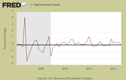
Why the BEA report doesn't give real personal income monthly changes including transfer receipts, instead of excluding them, I do not know. Below is the monthly percentage change in personal income, adjusted for inflation, excluding payments from the government. Since the price indexes declined and government payments are indexed to COLA, a yearly inflation adjustment for social security and so on, this might explain why the change for real income is higher for this month.
Disposable income is what is left over after taxes. DPI (disposable income), increased 0.2% from last month. That's not because people made way more money, it's because taxes were less.
Personal current taxes increased $6.9 billion in May, compared with an increase of $9.9 billion in April. Disposable personal income (DPI) -- personal income less personal current taxes -- increased $18.5 billion, or 0.2 percent, in May, compared with an increase of$19.5 billion, or 0.2 percent, in April.
DPI adjusted for inflation (see the price indexes above), increased 0.3%, from the previous month. These numbers are aggregates, which includes income of the uber-rich, or the 1% of the population, as they are now called.
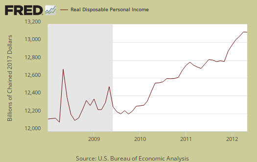
Below is real disposable income per capita. Per capita means evenly distributed per person and population increases every month. May mid-month the U.S. population was 313,976,000. In other words, while on aggregate personal income has increased, so has population to earn that income. When taking increased population into account, we basically have no growth in real personal income.
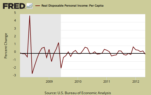
Interesting reality check huh? It seems politically, any mention of the effects of population on aggregate data is a no no and dismissed. Disposable income, when spread across increased population growth and adjusted for inflation shows it's often worse news, which makes declines even more miserable. The numbers reported in the press headlines are aggregates, or the total, regardless of how many more people are in the country.
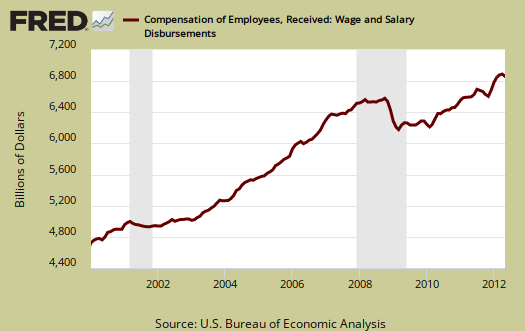
The monthly percentage change for wages and salaries was zero as was total compensation, which includes wages, salaries. Landlords just keep making out like bandits, rental income increased 0.9% in a month and proprietor's total income increased 0.4%. Personal receipts, income on assets, increased by 0.7%. This is income from non-incorporated businesses, such as the self-employed. Dividend income increased 0.6%, interest income, +0.8%.
Private wage and salary disbursements increased $1.1 billion inMay, compared with an increase of $5.3 billion in April. Goods-producing industries' payrolls decreased $7.0 billion, in contrast to an increase of $5.6 billion; manufacturing payrolls decreased $4.5 billion, in contrast to an increase of $3.2 billion. Services-producing industries' payrolls increased $8.3 billion, in contrast to a decrease of $0.4 billion. Government wage and salary disbursements increased $0.3 billion, compared with an increase of $0.4 billion.
Below are wages and salaries for the past decade. Notice the dip and the more flat line than earlier in the decade. Bear in mind these are aggregate, or all wages and salaries, and not adjusted for inflation.
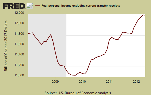
Below is personal income minus personal current transfer receipts. This graph shows how much personal income increased that wasn't funded by the government and is used as a recession indicator. Transfer receipts are payments from the government to individuals where no actual services (work) was performed. This includes social security, unemployment insurance, welfare, veterans benefits, Medicaid, Medicare and so on. Transfer receipts monthly change was +0.1%, not adjusted for inflation.
Transfer receipts really jumped in nominal dollars.
Personal current transfer receipts increased $1.2 billion, in contrast to a decrease of $0.8 billion.
Now recall how social security is projected to run out of money to the contributions to social security for this month from paychecks:
Contributions for government social insurance -- a subtraction in calculating personal income -- increased $0.4 billion in May, compared with an increase of $0.8 billion in April.
People need jobs, in order to pay into social security. Below is a graph of just transfer receipts.

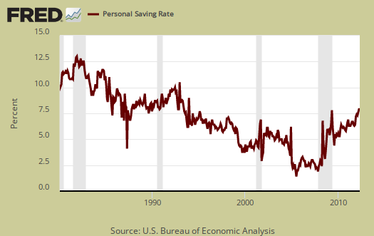
Personal savings is disposable income minus outlays, or consumption and not adjusted for inflation. The Personal Savings Rate was 3.9% in May.
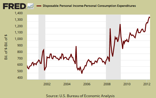
Below is disposable personal income minus personal consumption expenditures monthly raw total changes.
Personal Outlays are PCE, personal interest payments, and personal current transfer payments. PCE is defined above by percentages is almost all of personal outlays. Personal interest payments are things like the interest you pay on your credit card. Personal transfer payments are defined as:
Payments consisting of transfer payments by persons to government and to the rest of the world. Payments to government include donations, fees, and fines paid to Federal, state, and local governments, formerly classified as "personal nontax payments."
In other words, personal transfer payments are nothing more than that speeding ticket you just got or how you just donated to this site. People often confuse transfer payments with transfer receipts, not the same thing.
To visualize more data from this report, consider playing around with more of the St. Louis Federal Reserve Fred graphs.
Recent comments