Readers of my diaries probably know that I consider the bond market to be one of the most solid indicators of what lies ahead for the economy. In fact, the stock market is a leading economic indicator, and the bond market leads even that.
In 2006 and 2007 the bond market went into a mild inversion, i.e., interest rates on short term bonds were higher than rates on long term bonds. This is a historically accurate indication of recessions about 12 months further out. It does appear that we have dutifully slipped into recession in the early part of 2008 (although we may not "know" it officially until the final revisions to economic numbers is made official - several years from now!)
But beginning last August the Fed started to lower rates aggressively. By the beginning of this year, we had a nice, normal yield curve with much lower interest rates on short term bonds than on long term bonds. Beginning about that time, I began calling for a period of "respite" towards the end of this year from the "Slow Motion Bust" that began in 2006 and could last up to a decade.
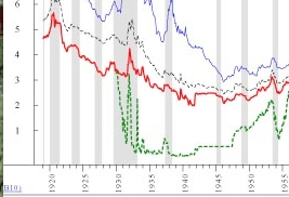
A graph I saw recently, courtesy of Ned Davis Research" via Theroxylandr in Flame a/k/a Roxy a/k/a Andy Bebut has caused me to question my reliance on the modern model. Here is the relevant portion of the graph in question, showing long term bond rates in red and short term rates in green, from 1930 through 1955 (you can ignore the other lines):

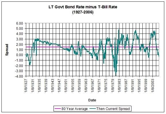
What is immediately noticeable about this graph is that, not once during that entire time did the yield curve invert The curve did invert in 1928-29, not shown on the above graph, but here's another graph including those years and all of that same era, showing the "spread" between long term interest rates and short term interest rates. A number above zero is a normal, or positively sloped yield curve. A number below zero represents an inverted yield curve:

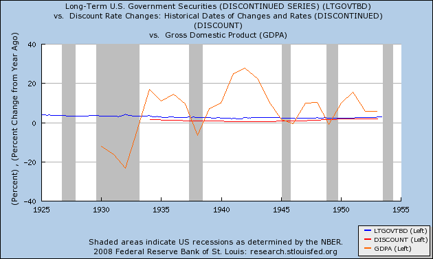
The graph shows the same thing. If one were to rely on a modern analysis of the yield curve, one would assume that there was economic growth throughout the period! Of course we know there was not. Here is the same graph of long and short term rates I used yesterday, but including the GDP (orange line) instead of the CPI from yesterday's graph:

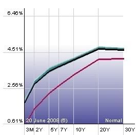
During the quarter century from 1929-54, an inverted yield curve didn't mean "recession", it meant catastrophe. And even a mild upward twitch from short term bonds (green in the top graph) was associated with recessions in 1938 and 1950. Which would mean that the upward move of the short and mid portions of the yield curve since early this year (shown in the graph below) would portend a further decline in the economy next year:

I'm not going to jettison reliance on the yield curve as an important indicator of what lies ahead -- in both eras it did give useful, but differing, signals -- but I am going to correlate it with two of the most important other variables: money supply (M1 and M2), and also CPI (to determine what the "real" i.e., inflation adjusted interest rates are). I am also going to watch the rest of this year carefully to see how much our current paradigm comports with 1954-2004 vs. 1927-54.
One way to know what to watch for is to look at what happened after the 1929 inversion. Not the 1929 stock market crash, but the year 1930. More on that later.

Comments
well researched
Obviously I'm not an economist but sometimes I think the theory, mathematics isn't well developed enough. For example, the "two variable" causality view. I also wonder if there are regions of variable "influence" in whether the economy is at full functionality or repressed.