
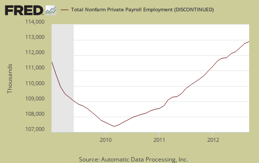
ADP, released their proprietary private payrolls jobs report for September 2012. This month ADP is reporting a gain of 162,000 private sector jobs. August 2012 was revised down by 12,000 to 189,000 private payrolls gains. In stark contrast, the BLS reported 103,000 private sector jobs for August 2012. ADP also revised down their July private sector jobs by 17,000 to 156,000. Graphed below are the reported private sector jobs from ADP. This report does not include government, or public jobs. ADP rarely mirrors the BLS employment report on a month to month basis.
ADP's reported private job growth was 144,000 in the service sector. This is the 5th month in a row most of the jobs have been in services. The goods sector only gained 18,000 jobs. ADP's Manufacturing tally, part of the goods sector, grew by 4,000 jobs, not a good showing. Construction gained 10,000 jobs, as reported last month and the best monthly showing since March, although ADP reports the unusual warm weather in winter was the cause for March's increase. ADP's financial services jobs increased by 7,000 jobs, making it a 14 month job gain streak in the private financial sector.
This report, if it matches Friday's official unemployment report, would overall imply overall modest job growth. Governments have just been shedding jobs, which are part of the BLS report. The U.S. needs about 100,000 jobs per month, minimum just to keep up with population growth, with the same lousy labor participation rate.
ADP captures jobs by business size, which is one of the best features of this report, due to it's relativity using the same statistical methods and timeline. In September:
Employment on large payrolls—those with 500 or more workers—increased 17,000 and employment on medium payrolls—those with 50 to 499 workers—rose 64,000 in September. Employment on small payrolls—those with up to 49 workers—rose 81,000 that same period.
Of the 64,000 jobs created on medium-sized payrolls, 10,000 jobs were created by the goods-producing sector and 54,000 jobs were created by the service-providing sector.
Below is the graph of ADP private sector job creation breakdown of large businesses (bright red), median business (blue) and small business (maroon). For large business jobs, the scale is on the right of the graph. Medium and Small businesses' scale is on the left.

Large business, who lobby Congress for their bad trade deals, more offshore outsourcing and more foreign guest worker importation and labor arbitrage, are almost absent from job creation in terms of hiring Americans. Notice how large businesses cliff dove in 2008, shedding employees, and have not returned at all to pre-recession employment levels. This pattern actually starts just about the time offshore outsourcing and the China PNTR came into effect, year 2000. Small businesses, on the other hand, have increased employment. May I suggest that small businesses are not international, they are not signing offshore outsourcing contracts and moving jobs to India and China. Multinationals, on the other hand, the below decade trend line clearly shows these so called U.S. corporations have abandoned the U.S. worker, on whole. Small businesses usually contain newly started businesses more by percentages as well.
There is a historic strong mismatch between ADP and the BLS jobs report on a month to month basis. To date, the number of private nonfarm payroll jobs ADP reports versus what the BLS reports and on a month-to-month and even cumulative basis do not match. This monthly error is often large, especially when looking at small job growth overall, or less than 400,000 jobs per month, on a month to month comparison basis. The monthly BLS jobs survey (CES) has a 100,000 payroll jobs overall margin of error.
The below graph shows shows how many private sector payroll jobs, each month, ADP was off by in comparison to what the BLS reported. This is a monthly graph, not cumulative. As we can see, it's rare where the two monthly reports get the exact same private payrolls growth numbers. When the below graph bar is negative, that means the BLS reported a larger number of jobs than ADP did, when the graph bar is positive, it means ADP reported larger private payrolls. Again, these are private sector jobs which is different from the BLS headline number. This graph is updated with the BLS jobs report.
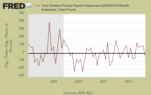
Below is the cumulative difference between what the ADP reports as the private nonfarm payroll jobs vs. the BLS (ADP minus BLS). This line shows the divergence, over time in number of nonfarm private payroll jobs reported between the two reports. The difference was stabilizing around 400,000, now increasing once again. This article is updated with the August BLS private non-farm payrolls data.

While ADP notes a simple correlation of 0.95, well, a 5% error between monthly reported jobs numbers is an average, and we can see on some months the differences are quite large and around 2008, the difference started to hit about 900,000 jobs. That said, the reported job growth is so piss pour, statistically we're rolling around in the margin of error each month.
ADP does use the same seasonal adjustment as the BLS, but their other methodology and even sampling size are different, proprietary. That said, ADP has now put up some details of their methodology to explain the statistical differences between their estimate, the actual mathematics, vs. the BLS. This is new, and good ADP is disclosing their entire methodology so we may get more apples to apples comparisons of the two reports. The graph below is the monthly change of private jobs as reported by ADP.

Regardless of the statistical differences between ADP and the BLS, September's report indicates moderate job growth, not the soaring robust growth the United States needs. Sorry folks, 150k range job growth numbers do not mean the Gods are now shining upon us.
Here is last month's ADP private sector jobs report overview, only graphs revised.
The initial claims numbers later this week always drive me nuts
Always amused every week when the 350,000-400,000 weekly claims are always puppeted by the talking points MSM as somehow "not as bad as expected" or "improvements from the previously modified and now dismal numbers from last week." As the labor participation rate is so bad and/or gets worse, wouldn't the initial claims have to keep dropping and dropping to not be as bad? I mean if 100 people are working, initial claims of 10 are bad (10% of people actually out there in labor force). If 90 people are now working, initial claims of 10 are not the same, but worse (11.1% of those working). And if 80 people are now working, then initial claims of 10 are obviously worse (12.5% of those in labor force). If the claims are steady or even close to the same numbers month after month after month with fewer people participating in labor force, how is that not seen as really bad by the media and pols? Or is it just a case of just don't analyze anything beyond the headlines' lies and spin?
I'm not even going to get into the quality of the new jobs regarding the lack of benefits, part-time, engineers and architects now stocking shelves at Home Depot if they can get past the "overqualified" barriers, etc. It's been done.
initial claims
If you look at the last two articles on initial claims, I show the relationship between initial claims and job creation. Initial claims are just what they sound like, the number of new unemployment claims for that week. It doesn't mean they will obtain benefits, just the number of filings.
Since Friday is the unemployment report, I won't be overviewing initial claims. Wall Street jumps on this number to trade on and it's really stupid in terms of long term employment trends but that's what they do.
To see an implication of job growth, you need initial claims to be about 365k or below, but the 4 week moving average needs to be this number.
The fact Wall street jumps on this is ridiculous as we've pointed out many, many times, but that's what they do.
Then, Wall street has priced in "forecasts" on various economic releases and when the number do not match their "forecasts" they also go nuts, because they have placed trades on those "forecasts".
Stock markets, futures, trades are simply not the real economy, so what can ya do, but that's why you see so much bullshit about the report, it's traders, Wall street, pushing that up.
I do initial claims overviews about once a month and try to hit about the mid-point between the BLS monthly unemployment report, which is the real thing that matters and that also has serious statistical issue when looking at the month to month figures.
Honestly, I expect this month's report to be a swing to the upside and all due to the CPS study variance, but we'll see.
The big report I'm going to analyze is manufacturing new orders, shipments, in a big, huge way because so many traders jumped on the durable goods advance release. That's my exercise for the reader overview tomorrow.
Friday of course I'll be all over the unemployment report with graph-o-ramas and custom number crunch.
Wow, the unemployment rate is absurdly divorced from reality now
Seriously, the rate drops to 7.8% with basically no jobs added? Election time shenanigans full speed ahead. "Conspiracy" theories seem to be correct and not so insane after all - anything to secure elections and political offices. When no one's working, seeking work because there are no jobs, not filing initial claims, and can't collect unemployment anymore, we'll have 0% unemployment.
check back
I'm writing up overviews now on how that is happening, yes that's absurd. Takes a while to graph up everything to show how that happened, working on it right now.
CT, no the BLS did NOT manipulate the unemployment stats.
Ok, this is going to take me a while for I have to do some fairly deep number crunching this month to explain a host of statistics from the CPS.
Bottom line, the CPS survey to me just doesn't have enough accuracy generally, needs to be expanded and more real time.
This is going to take me some hours though because I have to run some serious statistics and make some custom graphs, pull up some special numbers from databases and so on to explain how the hell one could get only 114,000 payroll jobs yet see outrageously bizarre inceases in the CPS.
So, I'm working on it, for all EP fans out there who are probably wondering where our overview is.
I also called up the BLS and got some pointers on some places to look for the hidden weirdness.
CT stands for conspiracy theory, so I will make a point to look at those writing up CT posts con graphs and "data" to refute (or confirm), but the real problem to me has always been the CPS survey size is way too small and we're missing concurrent other data to correlate as well, need more definitions in our disposable worker society.
The BLS is just a bunch of geeky people, doing their survey, statistical methods, number crunching groove thing. There is kind of a firewall between the geek people vs. the political/administration folk.
ZH says massive anomaly in 20-24 age group
Apparently a massive surge (unprecedented) in 20-24 year olds getting part-time work. Even if there is no "conspiracy," the fact that it's common knowledge no Pres. can get elected with unemployment at 8%+ only creates the appearance that all stats must be fixed to achieve the goal. And again, this whole debate is kind of ridiculous because people are jumping up and down in front of cameras on both sides ignoring the fact that most any jobs added in 2012 completely suck (e.g., no benefits, part-time, can't cover cost of fuel, housing, food).
Even without addressing statistical issues and random sampling questions and quality of jobs in 2012, Bloomberg's Trish Regan was still going on about how unemployment benefits might cause people to drop out of looking for work. Trish, wake the F up, once those benefits end, people starve or go homeless or both. Most self-employed people never got Day 1 of unemployment, so ask them how they survive. People aren't opting out of food and homes because they're so lazy after up to 99 weeks of "living the good life." Trish Regan, another overpaid puppet that is paid not to think.
that's true on 20-24 but hold on
But it's not enough to explain the difference. I always do this from first principles, number crunch directly. After I figure it out I might go check what others are claiming, but I do these always from the data series and methods directly. I'm taking your complaints and will see also what I can dig out in terms of "quality of jobs", which is very hard due to the way the BLS categories the sectors, occupational detail has a lag of 1-4 years from the monthlies.
I'll put up something in the CES in the interim since it's looking like I need to do some linear regression (unsure), hold on, don't want to say something until I'm sure of what I'm looking at.
ADP changing methods
Some details here, but this would be good since it rarely matches BLS private payrolls, so figuring out which number is right is currently impossible.
Hopefully they will make their data publicly available so we can still directly compare and graph.
This is good, now if only we could get some accurate statistics on workers by immigration status that would really help. We only have spin and fictional biased lobbyist white papers vs. any statistical accuracy. Be nice to actually know what's really going on wouldn't it?