
ADP's proprietary private payrolls jobs report gives us a monthly gain of just 139,000 private sector jobs for February 2014. January was revised downward significantly, from a solid 175,000 jobs initially reported to just 127 thousand for the month. Moody's blames the weather for the poor showing, which probably is part of the reason. Yet continued weakness in the job creation market would not be surprising as a trend. This report does not include government, or public jobs. The official BLS employment report for February will be released on Friday.
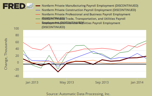
ADP's reported jobs gains in just the service sector were 120,000 private sector jobs. The goods sector gained were only 19,000 jobs with 14,000 of the goods sector jobs added being in construction. Professional/business services jobs grew by 33,000, the largest gain this year. Trade/transportation/utilities showed the strongest growth with 31,000 jobs. Financial activities payrolls lost -2,000 jobs. Financial activities had the worse two month showing since January and February of 2011 Manufacturing only added 1,000 jobs. Graphed below are the monthly job gains or losses for the five areas ADP covers, manufacturing (maroon), construction (blue), professional & business (red), trade, transportation & utilities (green) and financial services (orange). As we can see January's figures are as bleak as February.
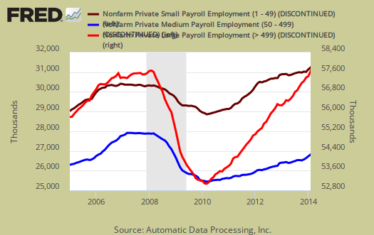
ADP reports payrolls by business size as well. Small business, 1 to 49 employees, added 59,000 jobs with establishments having less than 20 employees adding 32,000 of those jobs. This is a terrible showing, well below the 71,000 average jobs added by small business in 2013. ADP does count businesses with one employee in there figures. Medium sized business payrolls are defined as 50-499 employees, added 35,000 jobs. Medium business job growth was the lowest since April 2013. Large business added 44,000 to their payrolls. If we take the breakdown further, large businesses with greater than 1,000 workers, added 43,000 of those large business jobs, which means businesses with 500 to 999 employees only added 1,000 of those jobs.
Below is the graph of ADP private sector job creation breakdown of large businesses (bright red), median business (blue) and small business (maroon), by the above three levels. For large business jobs, the scale is on the right of the graph. Medium and Small businesses' scale is on the left.
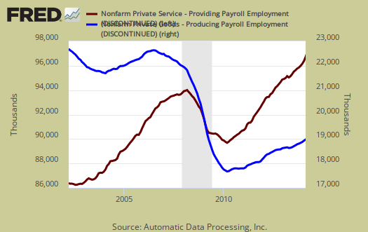
One of the more interesting aspects of the ADP report is the breakdown of the private sector by service producing and goods producing jobs. The service sector are disproportionately lower paying jobs as a whole in comparison to goods producing jobs, even while including the financial, professional and business services sectors are part of services. Below is the graph of ADP service sector (maroon, scale left) jobs against their goods production jobs (blue, scale right).
The ADP employment report, if it matches the BLS official unemployment report, would overall imply overall not enough job growth to keep up with population, as ADP reports just the private sector job growth. The U.S. needs about 115,000 jobs per month, minimum just to keep up with population growth, abet with the same lousy, artificially low, labor participation rates.
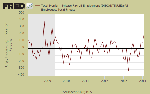
The ADP private payrolls rarely matches the BLS monthly employment figures. The monthly BLS jobs survey (CES) has a 100,000 payroll jobs overall margin of error. ADP changed their methodology and now claim to match the BLS private payrolls, but only historically, after revisions. The below graph shows shows how many private sector payroll jobs, each month, ADP was off by in comparison to what the BLS reported. This is a monthly graph, not cumulative. As we can see, it's been rare where the two monthly reports get the exact same private payrolls growth numbers. When the below graph bar is negative, that means the BLS reported a larger number of private jobs than ADP did, when the graph bar is positive, it means ADP reported larger private payrolls. Again, compared are private sector jobs which is different from the BLS headline number. The graph is updated with the BLS jobs figures.
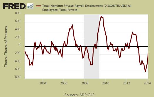
Below is the cumulative difference between what the ADP reports as the private nonfarm payroll jobs vs. the BLS (ADP minus BLS). This line shows the divergence, over time in number of nonfarm private payroll jobs reported between the two reports. Due to annual revisions, ADP and the BLS are matching up once again in reported cumulative private sector jobs. Regardless, one cannot infer from the ADP report what the BLS figures will show on new releases. ADP claims their private payrolls cover 24 million jobs with 416 thousand businesses in the U.S. This represents about 20% of U.S. payrolls. The graph is updated with BLS private non-farm payrolls data.
The graph below is the monthly change of private jobs as reported by ADP. At the absolutely bare minimum, the United States needs 1.2 million jobs per year, or 100,000 per month, total jobs, including public sector jobs, to keep up with additional new workers in the labor supply caused by population growth with the current terrible labor market conditions assumed.

Regardless of the statistical differences between ADP and the BLS, these payroll figures are a terrible sign. The real question is how much has the weather impacted the economy? Time will tell but such a harsh winter has surely had an impact. How much is actually a weak economy versus blaming the weather only time will tell.
Here are our overviews from previous months, only graphs revised. This article goes into the methodology details on the ADP report changes and compares historical data of the two methodologies in graphs.
ADP themselves have some great visuals on their website for more perspectives, breakdowns and charts of their statistics.
Staples to close 225 stores by 2015
The closings amount to 10 percent of all Staples locations. The company has 2,200 stores worldwide, 1,500 of them in the United States—so it's unclear how many jobs will be lost, or what locations will be shuttered. Staple's recent earnings report failed to meet Wall Street's expectations. Staple's stock is down this morning with significant trading.
http://www.boston.com/news/local/massachusetts/2014/03/06/staples-shutte...
http://www.google.com/finance?q=spls
kind of a shame too
Staples actually can have lower prices than anything on the Internets with sales and coupons. These brick and mortar stores are just getting hammered by Walmart and the online stores.
I run a business on the side and live in a rural area so I sure hope the local Staples isn't on the list. In the case of an emergency there will be nothing to go to.
But this is how it is with big box marts and online and watch, as they wipe out their competition, prices will increase, i.e. monopoly.
Unemployment
The fact that we still have high unemployment, relatively speaking, isn't taken seriously in this country.
Look at all the columns in most of the main stream blather, all of them remain hesistantly upbeat.
It isn't taken seriously by the Administration, Congress, who cruelly punished the unemployed (and the economy) by taking aways emergency benefits. Going further, it's in the interest of Banksters to keep unemployment high.
We live in bizarre times, after a horrendous economic downturn in which millions were never going to recover, we have an adminstration and lawmakers that lanched a sequester. There's a war on right here in the USA.