One well-known contrary sentiment indicator for what the next direction of the stock market is corporate insider trading. In the aggregate, insiders are more likely to purchase their company's stock when they think it's cheap, and to sell when it is expensive. In that way, they also tell us something about the health of the overall economy.
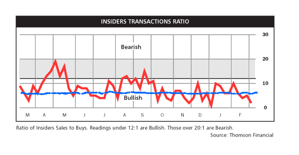
At the exact market bottom in March, when people thought the economy was about to drop into a black hole, I copied the insider trading graph from Barron's (which is a terrific weekly financial magazine and the best way imho to educate yourself about what is really going on in the markets and to become more sophisticated about the economy. Anyway, I digress). Here's what caught my eye about the graph then:

Insider selling was positively subterranean -- in other words, very bullish for the market. Two months and 30% higher, we know that insiders were, as usual, correct.
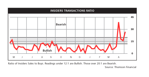
With that in mind, here is the graph now:

During the bear market of the last 18 months, whenever insider trading rose above the blue line I drew across the first graph, the market almost always declined in short order. Notice that in the last 4 weeks, insider buying has virtually disappeared while selling has burgeoned. You might wonder when the last time this happened was.
Although Barron's does not maintain online copies of old graphs, yours truly maintains a paper copy just for occasions like this. The last time the ratio of insider selling to buying rose significantly into "bearish" territory on a sustained basis, was April-June and September-October 2007 -- exactly at the twin peaks of the S&P 500 just before the onset of this recession.
If your interest is piqued now, consider also the following. Although alas I cannot find the graph online (but the raw data is here), Barrons also publishes a weekly graph comparing the CBOE Put/call Ratio vs. the S&P 100 ratio. As of this past Friday, the CBOE ratio was .6:1. The S&P 100 ratio was 1.1:1. Just before the big market declines during the recent bear market, there was a similar - but I hasten to add, not identical - pattern of a rising CBOE ratio to about .7:1, and a declining S&P 100 ratio to 1.4:1. (the S&P 100 ratio has been below 1/4:1 for several weeks now).
If those sentiment indicators suggest to me that the market is primed for a pullback, there are reasons to believe that the bear market pattern of indicators has been broken. As an initial matter, during the Nov. 2007-March 2009 bear market, insider trading only had to rise towards neutral for it to be a bearish indicator. It has broken through this for a month without a pullback yet.
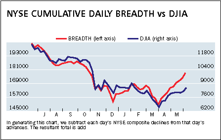
Furthermore, here is this week's chart, also from Barron's, of market breadth:

This measures how many stocks advanced vs. declined, compared with the advance/decline of the stock index. When relatively more stocks advance, that is good. When fewer advance (as relentlessly happened in 1998-2000), it's bad. You must be careful interpreting this graph, as neither y-axis value starts at zero, and their ratio to one another is not proportional.
But you can still compare relative movement within the graph. Again, this graph only goes back one year, but yours truly can tell you from paper copies faithfully kept that this is the most robust advance, with the most participation in advancing stocks, since the recession began.
Finally, it's worth pointing out that the investor senitment readings of stock newsletter writers isn't very bullish at this point. We are a far cry from enthusiasm.
So what am I looking for? A pullback, perhaps of 10%-12%, but not a cataclysm. A pullback will put the fear of G*d into optimists, but a pullback that stops far short of recent lows will also catch pessimists off-guard. Frequently, the most likely market scenario is the one that inflicts the most pain on all participants. A 10%-12% pullback should do that nicely.

Comments
The "W" appears?
I note may are now referring to the "W" type of recession instead of the "V" which you have mentioned many times.
I hope all of those believing their 401ks are recovering read this. That's the problem with gambling retirement on the stock market. So many get burned by these crashes.
More I think about it, that would make an excellent blog post. Just how many people lost everything in retirement savings from 2000-2001, 2008, now, since these 401ks came into being? What is also the real return on them, IRAs, SEPs, etc. for the last decade.
The time has come to sell this rally
I didn't need to read this post to know that. The fact that the S&P is increadibly overbought by every measure says so.
"Sell in May and go away"