
The much awaited January unemployment report is released and from the headlines, one would think this is great. It's not.
The reason is the U.S. lost another 20,000 jobs. The employment-population ratio rose from 58.2 to 58.4 percent. This means while the ratio of the employed to unemployed improved, it is in part because there are more people added to the general population who are not being counted in the potential workforce or inversely, a decrease in the overall civilian workforce, which causes the ratio to increase.
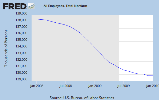
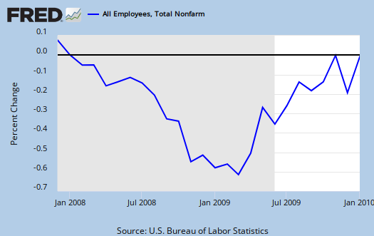
Below are the total non-farm payrolls. The first is the raw numbers and the second is in percent change from the previous months report. In nonfarm payrolls one can see the real job losses that are still occurring this recession.
The revisions are another reason this not so great news.
The total nonfarm employment level for March 2009 was revised downward by 902,000 (930,000 on a seasonally adjusted basis), or 0.7 percent. The previously published level for December 2009 was revised downward 1,390,000
The revision on the increases in job losses means the U.S. lost 8.4 million jobs in this recession, when previously it was reported to be about 7.2 million (officially).
U6, the broader definition of unemployment, dropped to 16.5% from 17.3%. The long term unemployed is now 6.3 million.
The civilian participation rate is at 64.7%. Yet the civilian non-institutional population decreased slightly (this is not seasonally adjusted).
Those not in the labor force rose 409,000 and is now 2.5 million.

There are a host of revisions to data generally, going back to year 2000, but when both unemployment and employment decrease, there is something not quite right with this picture. To that end, let's look at something I never do, not seasonally adjusted non-farm payrolls.
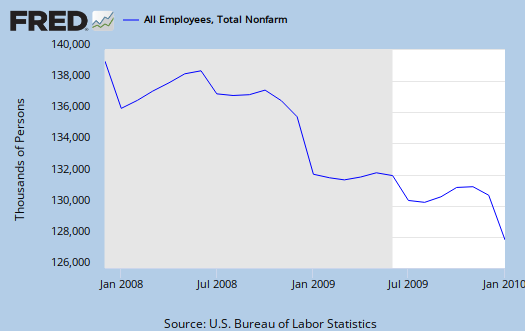
The reason to look at this is because while the official unemployment rate went down, the not seasonally adjusted unemployment rate skyrocketed, to 10.6% from last months 9.7%.
Again, there are a host of adjustments to examine as to how one can have a decrease in the official unemployment rate yet continue to lose jobs, but the above is highly suspect for statistical strangeness. More on plotting seasonally adjust versus not in another post.
Subject Meta:
Forum Categories:
| Attachment | Size |
|---|---|
| 335.73 KB |
I need such math
So when were they lying, earlier in the year when the million people were not counted or now?
"The revision on the increases in job losses means the U.S. lost 8.4 million jobs in this recession, when previously it was reported to be about 7.2 million (officially). "
I guess they really don't want us to peek at the U6 numbers!
The mouth organs are rolling today pronouncing the fantastical drop in unemployment. Some day's I really expect to see Alice and the March Hare running around.
"Have some wine,' the March Hare said in an encouraging tone.
Alice looked all round the table, but there was nothing on it but tea. `I don't see any wine,' she remarked.
`There isn't any,' said the March Hare"
The PTB expect us to believe the jobs are growing but there is nothing on the table.
BLS unemployment generally
It's just beyond belief confusing frankly and this is about the worst I've seen. A government statistic that people with economics degrees must turn around and parse, analyze for hours is not exactly clear intel to me.
I'm still looking at it all, I know something is wrong with this picture but the usual suspect, i.e. people just plain fell of the rolls and are not counted, I'm not quite finding it this time. It seems to be more with a host of adjustments.
The BLS warns that this month is a host of benchmark adjustments and I put that into this post, but I haven't learned yet what they all are and what's going on.
Yeah, I mean how did U6 go down when we don't have any new jobs?
Taking the job numbers with a grain of salt
I was going to attack the unemployment report, but you've already done an efficient job of it. However, I can add this.
Also, you already mentioned the 902K jobs revision, but you didn't mention what to expect in the future.
this is such a critically important statistic
and dare I say the focus of EP, I think regardless of what kind of data one believes everybody on here wants better and more jobs....heavy focus on the we need income, feel free to write up another post.
That's interesting and I think we need to dig much further into the benchmark and SA adjustments because I've been looking over all sorts of data points and this is just pure "scratch head" funky from the report alone.
I could use some more insight and frankly, if the WSJ and Bloomberg are noticing it, I think highlighting these is important, else we get just another MSM green shoot, feel good headline going on here.
I'm starting to feel real pissed at the BLS and DOL. I might come on here man, can you give an accurate view in simple English and numbers?
I mean, they focus on all of this statistical data from the 1960's, i.e. blacks, women, etc. all racial/sex demographics...
well, what about offshore outsourcing which is gravely affected everybody, not just traditional minorities here? We cannot get one piece of raw data about that! And....I know they count foreign guest workers in occupational statistics....let's see some citizen status demographics in these stats. Sorry but with global labor arbitrage I think this is relevant today.
I'm not saying to drop the other demographics...that's really important and whenever I see the Black stats, I am always like WTF, why in God's name are they having such a hard time? Now it looks like white male stats are looking bad and I don't think that's any great news for women....I think it's due to the perception that women are cheaper and more pliable, that jobs women are shoved into are usually the firing cannon fodder, lower wages types of jobs. (have to look at wage levels on this...)
anyway, you get my point, we are not getting raw data that would give a true accurate view and it's ridiculous in 2010.
My God, these cats literally get CPI by volunteers filling out, by hand, gobs of data....how ancient is that?
In other words, midtowng, please do write up another post, amplifying as far as I have gotten in the statistical dig, building off of it. The benchmarks, adjustments alone are a damn graduate student weekend homework assignment.
In the virtual economy.....
....who needs a stinking job? (End of gallows humor & sarcasm.)
Off topic: Are you familiar with the "R language"? I had forgotten all about it but noticed it recently (R Project and others). Might be too gargantuan a task to use here, plus it is on a complex level.
(Be really neat to try interfacing it with the Processing language, though. Just an off-the-wall thought.)
you mean add it to EP?
I cannot enable anything that creates an executable along with the ability to input whatever code you wish...
I think once this is mentioned you know why!
But I am relying way to heavily on the Fed for graphs and wondering what kind of stuff I can put on the site to enable fast graphing that is original as well as fast tables/stats.
I do have a primitive graphing ability on the site but the Fed database is so cool, very easy to use.
But like today, they don't have the stats I want to show...so here I am.
I was plain going to run a few Matlab scripts on some of these revisions and export the images, but obviously, that isn't exactly an easy tool for economists, never mind lay folk who want a picture of their data!
Agreed, but
...I was just fantasizing for a brief moment. The thought of coupling R programming with the Processing language to express the produced graphs in an animated fashion is food for deep thought.
But could only be accomplished in a completely dedicated site.
Gotta think about that though...
it's security
I have the last "hack" on this site half done, half baked which is what I need to do to move it into a module so I can upgrade this site into Drupal 6. (I hacked this code to death originally because I wanted certain functionality that I couldn't find, huge mistake with Drupal core)...
Anywho, let me think about that to do animated graphing. My first thought is hunting around for some sort of easy to use open source flash type deal.
But gee, firstly since no one but me even uses the zoom feature to enlarge images, never mind they are not scaled to the blog....I guess that's the first thing to work on (as well as getting a site look that isn't butt ugly that actually works for all of the features! )
The spammers, attackers, hackers are so intense, with script kiddies to hand jobs....I cannot imagine creating a site which allows executable code. Maybe with JAVA and then some sort of R interfacing type deal which restricts the code to only very certain data types...
but PHP is bad enough plugging up all of the holes and believe me, I've been behind the scenes, plugging and pluggin...
;)
We salute you
And for those reasons we really salute and applaud you, Mr. Oak (probably even the majority of all those site lurkers, one hopes).
My suggestion was really pure fantasy anyway -- I was just trying to imagine what a combo of the R language with the Processing language could do to conveying stat ideas in an interest-invoking, moving, graphical way.
I've got to spend some quality time on that myself.
Thanks again, R.O.
CBS evening news, pure propaganda
My God, I just flipped on CBS evening news and they literally put on TATA, the notorious Indian offshore outsourcer, who while operating in the U.S., almost all of their employees are Indians on guest worker Visas, an example of pure labor arbitrage, pure displacement and I personally think should be brought up also on discrimination class action against all U.S. citizen workers....
anywho, they were interviewed as a company "hiring". Surrounded completely by very obvious H-1B and L-1 workers they claimed to be "hiring". Shame they did not mention those were Indians, here to facilitate offshore outsourcing of jobs and displacement of U.S. citizens, in particular I.T. people.
Just incredible. They also had other interviews as if there are jobs out there, completely ignoring the fact this report shows the U.S. just lost another 22,000 jobs. Just to keep up the job creation estimates are 85k to 150k jobs per month.
Self Employed and Contract Labor Not in the Stats
This is just another game by the government to control what we see just like inflation.
People who run out of unemployment - magically stop looking because according to the government once they stop paying your benefits you no longer need money and if you were never eligible in the first place by their standards - you can NEVER be unemployed in the first place.
The only thing keeping this from being the great depression all over again is the safety valve programs such as welfare and section 8 food stamps etc. Those programs also keep a huge tax overhead in place that is mandated and can't be removed. It keeps the government from using tax cuts or useful levels of targeted stimulus spending also since we don't have the money to spare. This makes the case for long term stagnation and recession much more possible. Just my unqualified opinion.
Bureau of Lying Statistics is Alive
It's become like a living entity. A villainous character in the play "The Destruction of America."
It is the enemy. It is part of a cabal of villains pushing the people ever closer to revolt. This cabal has one purpose: As the situation on the ground for real people continues to get worse and worse, the cabal of villains is in charge of an endless propaganda pump, feeding the masses a steady diet of fodder saying "Nothing to see here folks, move along, our great leader has it all figured out."
The Bureau of Lying Statistics is an arm of a propaganda machine. A machine that continually tells us not to believe that which we see and experience for ourselves, but to believe the complete opposite which that they feed us. It is an propaganda arm dedicated to a continuous pouring of salt into America's open wounds. And as the situation on the ground gets worse and worse, the Propaganda Pump will all the more try and tell us things are getting better and better. And at the very front of the Propaganda Pump will be the Bureau of Lying Statistics.
This will go on until the American people literally take apart this Pump with their bare hands.
Bloomberg unemployment birth death model
Bloomberg put together a flash presentation on how the unemployment rate is affects by the population survey (birth-death model) and thus is giving us major inaccuracies in the unemployment rate.
I've amplified a host of these but this is a good graphic explanation.
The key thing to remember is the unemployment rate is a ratio. Recall I do my best to dig around to discover the actual number of jobs and the actual increase, or decrease in the real number of workers available (civilian population rate) and also focus on how many fell off the count.
But if Bloomberg is nailing it, well, this ain't no conspiracy theory on trying to obtain accurate statistics.