One of the most visible measures of the condition of working families is the price level of a day’s wages. So, we figured it might make sense to subject those wages to the same sort of analysis we used in the last post: the withering criticism of an ounce of gold.
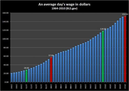
Here is a chart of an average day’s wage since 1964, as presented by the Bureau of Labor Statistics:

Chart 1: Average day's wage in dollars (1964-2010) (Source: bls.gov)
As is befitting a labor force enjoying the prosperity of the freest, most productive, nation on the planet, we have seen our wages rising for the entire period from 1964 to 2010. Even through depressions as intense as that of the Great Stagflation (the first set of green and red bars) and the current Great Recession (the second set of green and red bars) the average day’s wage of American workers has never fallen year over year.
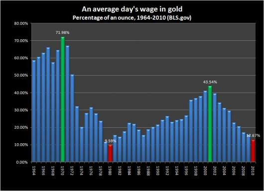
Unfortunately, things are not so rosy when the value of a day’s wage is measured by an ounce of gold:

Chart 2: Average day's wage in gold (1964-2010) (Source: bls.gov)
Recent comments